In a world where we can access anything at any time, grabbing someone’s attention has become pretty difficult. In fact, attention spans on social media platforms are said to be just 2 seconds (even less on mobile).
With little time to start or build on relationships with users, impactful, engaging and rewarding content and experiences have come to the forefront.
This has ultimately meant that companies have had to reevaluate how they approached products and services, introducing a new wave of gamification in UI design.
But what are some of the methods for using gamification in UI design? Design teams have employed points, leaderboards, prizes/badges, progress meters and quizzes to increase engagement, retain users and create enjoyable user experiences.
Carry on reading to see examples of these clever ways of employing gamification in UI design below.
Gamification in UI Design
Points/Scores
Ah points. We all love earning things. Most of us love seeing how well we’ve performed when we’ve put in the effort too; spending more than we normally would to pushing on in a video game. Points make us want to take action to not only see how well we do, but to improve or grow our overall score.
Tesco Clubcard:
What? – Any loyalty scheme card could apply here; Starbucks, Subway, Nectar card, but as we think Tesco have continued to re-invent their offering, we’ll go with their Clubcard.
Shoppers earn points using the physical card or the app at checkout, with access to exclusive pricing on select products, additional money off vouchers, and the ability to earn points towards vouchers. You gain 1 point per pound spent, which is easy to understand, and the app makes it easy to know how many points you have (and importantly, how many you need to get that trip to Thorpe Park).
What’s the lesson? – For experiences like apps, making your points or scores easy to understand and visible is key. For something that’s monitored on a recurring basis (like Clubcard points), placement considerations are required for keeping it front of mind when shopping.
Highlighting time-specific events in the app is also advantageous. This gives users a reason to login when they may not have been planning to and makes checking the app when shopping a habit.
Ecosia:
What? – Now to be fair, Bing has a great system in place for search rewards. Bing gives you points for completing searches, surveys and other tasks before allowing you to redeem them on various rewards. However, I personally like Ecosia’s social mission that’s tied into search rewards.
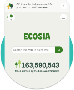
Ecosia is a search engine that commits ad revenue to tree planting, planting over 159 million trees as of writing. The best thing about it is that it presents the impact of your searches in the most simplistic way, a tree counter in the top right! It’s straight forward and is always nice to check back on your tree counter every now and again.
What’s the lesson? – You can add points to nearly any activity, including searches. Consider a list of activities that someone complete on your app or website that could result in points. This could be a daily login score or for completing a feedback form.
You should focus on areas that the organisation would also find of value for more points, directing users towards a particular high value objective.

Levels/Ranking
Whether it’s a blackboard in the gym that shows the biggest lift to your finish in the latest racing simulator, a simple leaderboard can be a big motivator.
Ranking and levels can be a great way for customers to show their commitment and can tie perfectly into the points we mentioned in the last section. They both achieve the same goal, acting as something to aspire for. Scores alone are great, but setting milestones with rewards attached can take gamification within your user interface to the next level.
Ecologi:
What? – Plenty of video games and fitness apps encourage long term relationships through leaderboards. But they aren’t the only companies adopting this approach to gamification in their UI design.
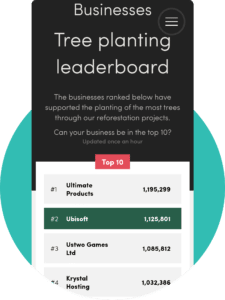
Social action organisation Ecologi delivers competitive leaderboards across its different audience types, individuals, businesses and referrals.
Accessible both logged in or out, the various leaderboards allow people to keep up with their contributions and those of others. With all three split up, the leaderboard can encourage individuals to have a social impact across all options, e.g. encouraging business take up.
Leaderboards also offer a community aspect to organisations, creating a friendly (or competitive) rivalry and encouraging continued support of their projects.
What’s the lesson? – Having leaderboards can be a simple way of using data to show users their impact and create a community feel. The impact of community can’t be understated too. It can help inspire users to continue to use or increase their contributions in order to get onto the leaderboard in the long term.
By making leaderboards accessible and crediting users for a key achievement, you can help create a user base that are more invested in your organisation’s mission.

Progress Meters
Similar to levels and ranking, progress meters look at the individual rather than the crowd. They provide a visual display of your steps to goal completion. This could be anything from making sure you’ve signed all relevant documentation for your new job to ensuring your project is on track.
Memrise:
What? – I’ve had a few attempts at learning Portuguese in my time and using an app has felt like the most accessible option considering my available time. The language app, Memrise, has several ways of encouraging your progression through their language courses.
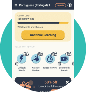
This includes progress against different sections of learning (e.g. you’ve learned 24 out of 28 words in ‘Beginner Spanish’) and a ‘streak’ chart that highlights words you’ve learned today and minutes you’ve spent learning.

What’s the lesson? – Showing people how far they’ve come can be a great motivator in encouraging repeated use. It says “we’ve started this, so let’s finish it” to the user.
Employing a visual or quantitative indicator of reaching the next milestone should be considered where possible. Ideally putting this on a dashboard or homepage can be particularly impactful, with a call-to-action to continue from where they left off creating a seamless transition.
Prizes/Badges
We love having our achievements recognised. From physical medals on sports day to badges from Scouts, these symbols represent your accomplishments and help users feel valued for their custom.
Strava:
What? – When it comes to motivating you to get a sweat on and smash your running goals, Strava takes the cake. When recording a run, you get detailed insights on how your performance measures up to previous outings, complete with ‘Achievements’ like gold medals for PRs on certain segments.
This fun, easy to understand breakdown of your metrics makes analytics easier to digest and encourages users to run faster and further.
What’s the lesson? – Simple visual cues for achievement like virtual medals or sounds triggered by an accomplishment can improve a user’s experience over an otherwise metric heavy data set.
Xbox 360 Achievements:
What? – I still hear the sound of an achievement popping up. Xbox pioneered gamification on top of games themselves funnily enough, bringing to the forefront optional ‘Achievements’ when performing specific tasks while playing.
Not only could you view the ‘Achievements’ against each title and plan getting them all, but they also meant gamers were playing for longer, exploring different game modes and buying downloadable content to complete the set.
There was a community element to this too. You could check the achievements of friends and other players, giving players something to discuss over the message boards.
What’s the lesson? – Encouraging users to explore more of an experience can be done by offering them small virtual rewards. If you tie this into the community, this can be particularly impactful, spotlighting specific users for their achievements.
Quizzes
Particularly relevant in E-Learning, teams are often looking for ways to ensure learning is enjoyable and information is retained. Quizzes are a great way of achieving this.
Coming in all shapes and sizes (matching exercises, fill in the blanks), quizzes can help users apply their knowledge in an alternative way for more active learners. Bridge supports these findings with activities, gamification and group discussions having a significant boost to knowledge retention.
Memrise (again):
What? – As an e-learning platform for foreign languages, Memrise needed to bridge the learning gap not only for written words, but also for how people hear and speak them back too.
The app seems to pull this off perfectly though, adopting a range of multimedia like audio and video files to ask students questions like:
- What does this written word (on screen) mean?
- What does this spoken phrase mean?
- How would you spell the word for this?
It’s versatile, keeps you guessing and reinforces your vocabulary consistently without the feeling that you’d rather read a text book.
Words learned all contribute towards progression, with a visual of a seed growing every time a word/phrase is successfully identified. For unsuccessful attempts, words are then repeated later on, giving users a chance to continue familiarising themselves before progressing. This is benefited by the fact the words are approached via speech, written word, and listening challenges, meaning you won’t repeatedly get the same question format every time.
What’s the lesson? – Quizzes can be a great way for reinforcing teachings through more engaging methods. Although not always possible, where relevant, you should think about applying multimedia in your quizzes. Memrise’s use of multimedia helped keep learning fresh and delivered multiple ways of thinking about languages to improve understanding.
For questions, you should also consider having multiple ways of approaching the same answer. Diversity in the format can prevent repeating answers quickly after a failed attempt and they’re learning instead of using muscle memory.
Let’s Gamify Your Next Big Project
At PixelTree, we’ve worked with teams big and small release web and app experiences that excite and delight users.
Partner up with our team of world-class user experience designers by getting in touch through our contact form.