We love to talk a lot about design sprints in this blog (we’ve talked about the sprint process, the toolkit you need for a sprint, who to invite to your team and so much more) and like to think we practice what we preach.
But we’re not alone.
From Google and Slack to LEGO and Facebook, some of the biggest companies in the world have used design sprints to tackle big problems, test new ideas, validate exciting concepts, and reduce the risk on otherwise risky propositions.
Check out an overview of their stories, the challenge they came in with and what they left their design sprint with.
Get your FREE Design Sprint Guide
Download our FREE guide on running a 4-day Design Sprint complete with stages, tasks and common pitfalls.
Companies that have used design sprints:
Google:
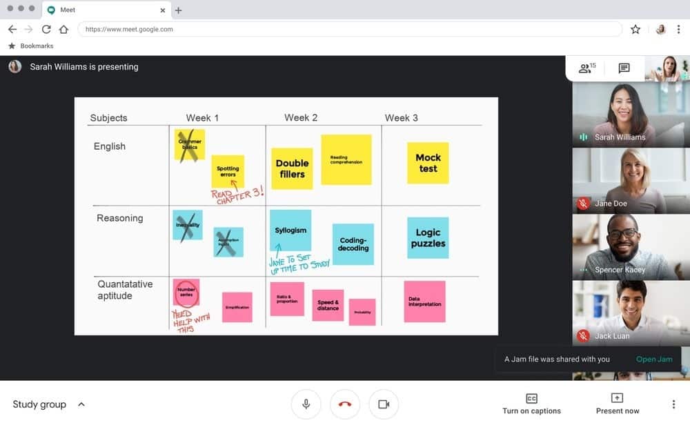
Their Challenge: To create and prototype a video meeting software that could run in browser.
A much smaller version of the behemoth we know today, Google’s Jake Knapp ran a sprint after visitng Stockholm to test a concept for video meetings. The goal being to maintain a social level of contact and conduct meetings they strive for in-person despite being based in different locations.
Their Outcome: Google Meet (formerly known as Google Hangouts)
What would later become Google Hangouts would be prototyped within the week Jake Knapp was in Sweden before being tested over the course of a few months with colleagues at Google.
Not long after, Google Meet would become used across the organisation.
For more info, read Jake Knapp’s Sprint pages 2-4.
LEGO
Their Challenge: To radically transform how they currently think about product development and how they can harness rapid design principles to tackle big problems and challenges.
In 2017, the LEGO team put aside their day-to-day roles to transform how they went about product design and development.
With the goal of continuing to “invent the future of play”, their management team felt that experimentation and innovation was falling behind their vision and wanted to up the ante in both speed and output quality.
Their Outcome: They changed the mentality of the entire company by running many sprints and establishing it as their go to methodology.
By the end of the first week, the team had run 10 design sprints concurrently, completing over 150 by the end of the first year! This helped the company overcome the hurdle of integration by simply building repetitive action across teams to the point where everyone was on the same page.
Read the full story from AJ&Smart’s Jonathan Courtney: How LEGO Run Design Sprints at Scale | by Jonathan Courtney | UX Planet
Erik Brandsgard LEGO
Facebook:
Their Challenge: To make the news feed less cluttered, easier to navigate and more engaging for their 2 billion users.
Although already highly optimised in how it delivers content to users, new user research had informed the product team that the news feed had become overwhelming and untargeted, while others mentioned difficulty getting to pages and screens they needed.
The issue was, with such a large user base, any changes could spark fierce opposition from users, who will already be accustomed to navigating a certain way.
How could they go about making the change in a way that wasn’t too much of a wholesale change but impactful enough to address that criticism.
Their Outcome: Meaningful tweaks to multiple areas of the news feed
With the challenges and feedback in mind, the Facebook team embarked on a host of ‘design treatments’ including:
- Improving the visual hierarchy
- Increasing font size, tap target sizes, and improving colour contrast
- Adopting clearer iconography
- Cutting back on excess UI and expanding content to be full width and more immersive
Feedback from first impression testing was really positive:
- “Pictures seem bigger”
- “More modern”
- “Text seems different, punchier”
For more info, check out Ryan Freitas’s post on Medium: Evolving the Facebook News Feed to Serve You Better | by Ryan Freitas | Design at Meta | Medium
Slack:
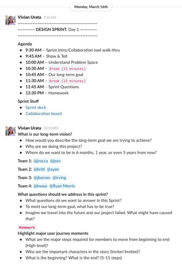
Their Challenge: To create marketing communications that would explain what Slack is to potential customers but doesn’t typecast it as just a “messaging app”
Gone from the days of being a games company under the name Glitch, Slack had pivoted into the B2B space and was beloved by Silicon Valley. But to break through to the wider business community, they’d need to explain just what they did and how it wasn’t just a team messaging platform.
How they communicated their value would be critical and could make or break whether they could expand beyond their Silicon Valley bubble.
Their Outcome: ‘The Tenacious Tour’ explainer concept
From their sprint came the ideas of an animated explainer video, a guided step-by-step tour (The Tenacious Tour), a computer-generated team that people could try Slack with (Bot Team) and a high-profile case study.
Of these options, they tested the two highest potential concepts according to the deciders; The Tenacious Tour and the Bot Team.
When put into the hands of users for real feedback, The Tenacious Tour came out on top in terms of being understood and explaining the value of using Slack.
For more info, read Jake Knapp’s Sprint pages 129-131, 143-144, 220-223.
WeWork:
Their Challenge: To find ways of monetising the dead time for offices that weren’t rented and maximise revenue from their leased spaces.
Beyond their core business model of renting out office, desk and events spaces, The We Company needed to look at generating revenue from spaces they held, but were sitting empty.
Ultimately, the team came to the conclusion that one-off bookings/an on-demand booking model could fill this gap, offering a monetisable service while minimising empty spaces.
But before they go all out on creating landing pages, integrating with a booking system and creating guidelines around use of said spaces, they wanted to test its viability with the public before investing in the infrastructure and de-risk the concept via a design sprint.
Their Outcome: The design sprint’s user feedback invalidated the concept of one-off bookings.
Using a 4-day design sprint and an iteration sprint to further refine results, the company was able to deliver a functioning commerce platform and service strategy in just under a month.
However, after running testing and simulations of real usage, the WeWork team opted to not push forward with going live and decided to shelve the idea based on feedback for the time being.
This may sound negative, but the team were pleased with the fact they saved time and money that would have otherwise gone into producing the result by testing and validating first.
Find out more by seeing Toi’s case study here: A Design Sprint (actually) saved WeWork a ton of money | by Toi | Sprint Stories
OVO Energy:
Their Challenge: To help customers better understand how their energy usage equates to their bills on their online account.
Being a leading independent energy supplier, the OVO Energy team worked with customers varying in digital savviness. However, the team realised that despite visual displays of what energy consumption was like on customers’ online accounts, they still felt it was difficult to translate this into the costs they paid at the end of the month.
With this in mind, the team set out to simplify how they presented data to improve customer experiences and help them understand their own usage and bills.
Their Outcome: A prototype they could iterate on before embedding updates to their online customer accounts.
The team produced a number of concepts including graphs with predicted usage by end of month, embedding different graphs on the account overview and building cost displays separating current cost, after next direct debit and the end of the month.
After trialing their end concept with 5 users, they came to the conclusion that although their result wasn’t perfect, there was a clear roadmap they could iterate from to get to their desired solution.
Read the full story here: OVO Energy: Our first design sprint | by Luke Howells | Sprint Stories
A User Validated Prototype… in Just 4 Days
Get in touch today to hear how we can help you sprint toward success.

